How to Check Values in Your Painting (Using Black and White)
Value simply means how light or how dark something is. Not its color, not whether it is warm or cool, just its position between white and black.
Value is what creates structure. It separates foreground from background, defines form, and decides what stands out and what recedes. You can have perfect colors and still end up with a flat painting if the values are too similar. When people say their painting looks bland or that nothing stands out, it is almost always a value problem.
Our eyes are easily distracted by color. A bright red feels important even if it is actually mid-tone. A deep blue can feel dark even when it is lighter than the surrounding shapes. If you want clarity, you have to remove color from the equation.
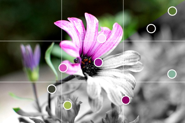 Converting a reference image to black and white helps see values more clearly
Step 1: Convert the reference to black and white
In the editor, scroll to the Image section and switch on Preview in black and white.
The photo immediately becomes monochrome, but everything else stays in place. Your grids remain visible. Your color markers remain visible. You can still see what colors you identified earlier, but now you see the value structure clearly.
This makes it obvious where the true lights are, where the darkest accents sit, and whether your focal point actually has enough contrast.
If two areas look almost identical in grayscale, they will blend together in your painting no matter how different the colors are.
Step 2: Check your painting against the reference
Paint as usual, then step back and compare.
Open the editor in full screen mode and place your laptop, tablet, or phone next to your painting. Squint at both. If needed, temporarily view your painting through your camera in black and white to compare value patterns directly.
You are not checking color accuracy here. You are checking:
- Are the darkest areas dark enough?
- Are the lightest areas light enough?
- Does the focal area have stronger contrast than the rest?
- Are large shapes clearly separated?
If the reference shows a strong light-dark separation and your version looks mid-tone everywhere, you know exactly what to adjust.
Step 3: Adjust before adding more detail
Correct the big value relationships first. Do not compensate with more color or more detail. If the underlying value structure is weak, additional work will only make it busier, not clearer.
Because the editor keeps grids and color markers visible even in black and white preview, you can move between value checking and color mixing without losing your structure.
Clear values make paintings readable. If something feels off, switch to black and white and check the structure before doing anything else.
Open your reference in the editor, turn on black and white preview, and see what is actually there.
Upload a reference photo and start painting!
Try Paint From Photos and simplify your painting process right now!