How to Build a Color Palette From a Reference Photo
You might have heard the phrase "paint what you see, not what you know" many times. You "know" that a tomato is red all over, but if you really look at it, the bottom side of it may actually be purple because it is sitting on a purple plate. You "know" that a wall is white, but because of the light conditions it is yellowish in the light and slightly greyish-blue in the shadow.
Colors are difficult to judge well because your eyes and brain constantly correct what you see so that objects make sense. Your brain is built to recognize things quickly, but in painting this correction becomes a problem when you want to put the "real" colors on the canvas.
Take a look at this scrumptious tomato picture and try to tell what the color is in the shadow of the stalk.
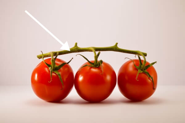 What color is this?
What color would you say it is? Most people, having seen a tomato and knowing that stalks are green, would answer green.
Scroll a little further.
.
.
.
It is actually orangey-brown!
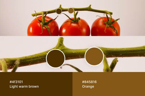 Now the color is isolated, it is clearly brown
Once the color is isolated, it becomes obvious. Inside the full image, surrounded by other colors and influenced by light and contrast, it is much harder to judge correctly.
What looks like "green" might actually be a cool gray. A shadow that feels purple might be a muted brown. White is rarely pure white: it can be light orange or slightly greenish gray. The same problem exists with value. The well-known chessboard shadow illusion shows two squares being exactly the same color even though one is "white" and the other is "black".
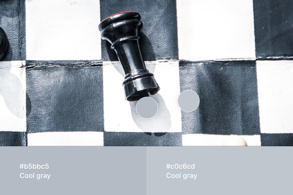 A white square in the shadow can actually be even darker than a black square in the light
Reflections of other surfaces, shadows, lighting conditions, and surrounding colors all contribute to this confusion. It is genuinely difficult to see a color separately from everything around it while mixing and applying paint.
This is where the editor can help.
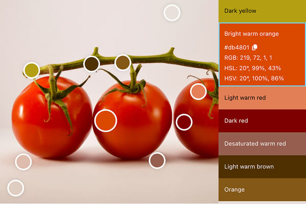
1. Start With Automatically Detected Colors
When you upload your reference, the editor identifies the most distinctive colors in the image.
Round markers appear directly on the photo, each representing a sampled color from a specific area.
Each marker:
- Shows a larger color area
- Stays anchored to the exact sampled spot
- Makes it easy to compare your brush mix directly with the reference.
Instead of guessing which colors are where, you immediately see the dominant sky, grass, skin tones, shadows, and highlights.
2. Add Your Own Color Samples
You can click anywhere on the image to add your own sample.
Click on:
- A transition between light and shadow
- A reflected highlight
- A subtle background tone
A new color marker appears at that location.
3. Refine the Sampling Point
Drag the marker until it is exactly where you want to check the color.
Sometimes a few pixels make a noticeable difference:
- Slightly warmer
- Slightly darker
- More saturated than expected
You can also delete color markers that are not necessary.
4. More Color Info in the Side Panel
All sampled colors appear in the side panel as a list.
Each line:
- Is filled with the actual color
- Shows its name and values
- Can be expanded for details
Clicking a color reveals:
- RGB and HSL values
- A color name with helpful tone or temperature qualifiers, such as "Cool green" or "Desaturated orange".
Seeing colors grouped vertically makes comparison easier than scanning the whole image.
You quickly notice:
- Which colors are warmer or cooler
- Which are muted
- Which are brighter than expected
 Paint From Photos UI: side panel with expanded color details
5. Compare While Mixing
Open the editor full screen on a tablet or laptop beside your easel. You can also export and print the image in full resolution with markers visible.
Now to painting! Mix your paint, load the brush or the palette knife, and hold it close to the color circle on screen or paper.
Because the sample area is clearly marked, you're comparing the color in a relative isolation, which makes it so much easier.
Why This Works Better Than Eyeballing
Without structured sampling:
- You mix based on memory
- You chase color adjustments repeatedly
- You overlook subtle shifts in temperature
Here:
- Key colors are identified instantly
- Samples are precise and movable
- Values and structure are visible
- The reference becomes organized instead of chaotic
You spend less time correcting mixtures and more time applying paint.
Try it with your next reference photo and build a palette before you start painting.
Upload a reference photo and start painting!
Try Paint From Photos and simplify your painting process right now!